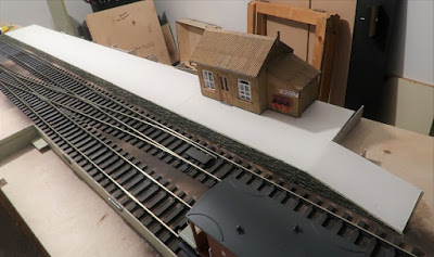
Unlike Hopwood the killer structure was always going to be the platform simply because it dominates. Though a day slicing up bits of card didn't make it quick either. The basic structure is in, just the edging stones and the surface to go down sometime in the future. It's a little rough round the back and at the ends, but this will be covered with other scenic bits and bobs so it hardly matters.
Am I feeling warm to this? Not as yet.

Hi Chris.
ReplyDeleteAs appealing as 0 Gauge is there is an issue, in my mind anyway, with depth of field. Much mention is made when referring to layouts in all scales of length. The width is in my view more important. My current effort in lockdown is a bare 6 feet long, yet it is about 16 inches wide. That extra space over the 12 width of a lot of small layouts adds a lot of potential.
The photo above, and of course the camera might be lying, looks as if a few more inches behind the platform and station building would enhance the space.
Iain Rice went on record to say that platforms are thieves of space and I face a conundrum of that kind with my latest project. Thinking of Arun Quay, plenty of width and no passenger facilities.
Anyway, good progress and it will be interesting to see how things turn out.
Stay safe.
Kind regards.
Kane
The platform is standard early light rly sizing at 202 scale feet. The brief I had was that it has to nominally sit on the trade stand at Warley (will that happen?) so 3m x 400mm is the largest I can fit in. I agree wholeheartedly with the 'thieves of space' comment.
DeletePlatforms mean coaches, and coaches are evil and dull. And people who know LOTS about coaches are really dull. Jus' sayin'
ReplyDeleteWith a couple of exceptions, you may be right.
DeleteNarrow platforms, even at the "correct" height always seem to look taller, particularly if they're also short. My instinct is to try and reduce the height to the believable minimum, wherever possible.
ReplyDeleteGiles